**
IMPORTANT UPDATE **
I recently purchased a new computer and a new phone and these have both highlighted a big issue with the image colours on this website that I had previously been unaware of. It seems that newer devices show the colour as being much redder than it appears on my older devices and this is more red than the actual specimen. This is the complete opposite of what I aim for when editing my images. Historically I have always tried to ensure that the crocoite colour appears slightly more orange on my screen than the specimen does in person. This ensured that upon receipt the customers would only ever be happy to find the colour of the specimen to be redder than they had expected rather than being disappointed to find it is more orange.
To demonstrate this issue please look at the following :
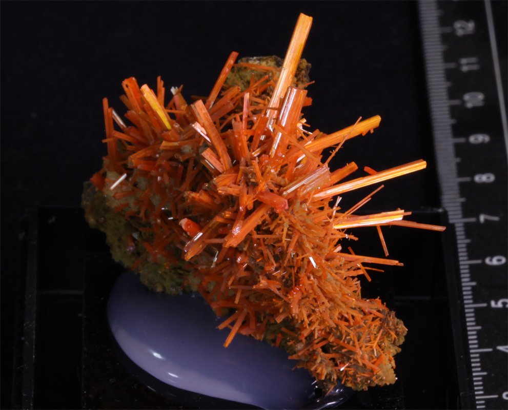
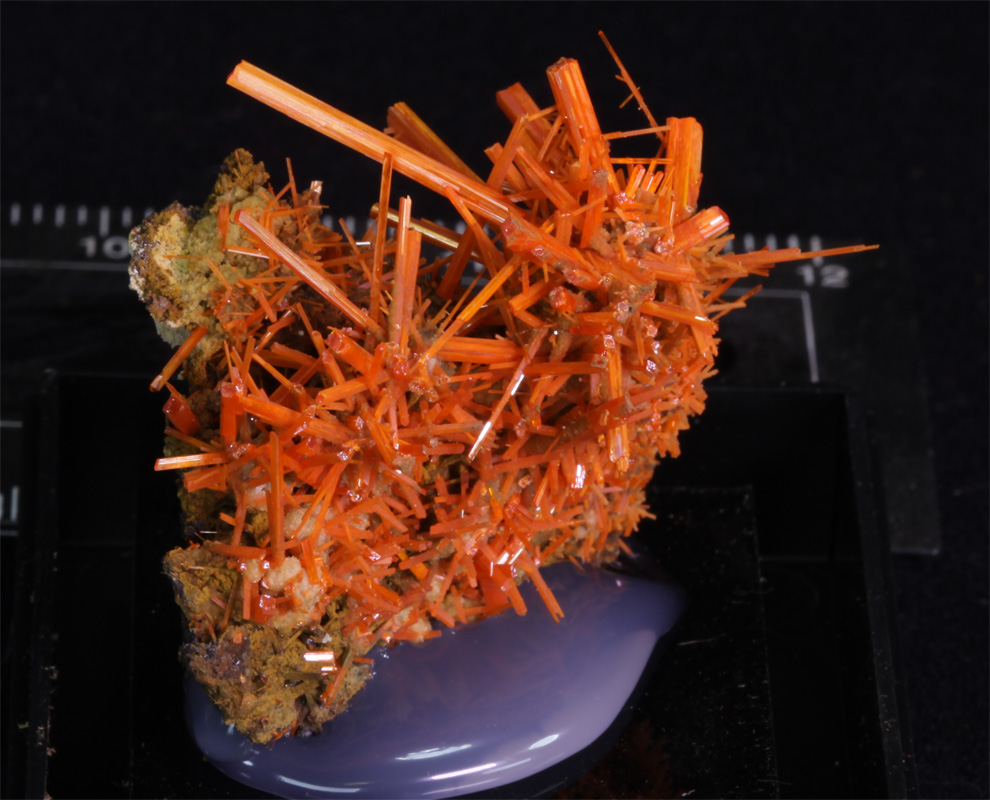
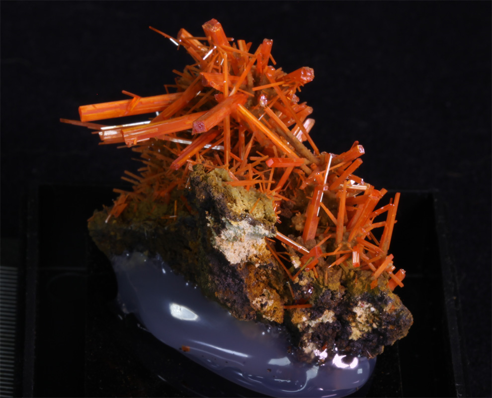
On newer devices the coke can on the left will appear a little bit of a darker red than they are in reality and on older devices the coke can on the right will appear a little bit of a lighter red than you'd expect in person. For a coke can the colour differences is only fairly slight and not important but you can see how much difference this can make for the following specimen :
From now on I will add a page showing images in the correct colour for older devices and also another page with images suitable for newer devices.
You can use the images above or this basic Colour Test Page to check which of the pages will be the most appropriate for you to view.
Other Notes :
The dimensions shown for specimens are listed apply for the item as it is positioned in the first image.
The detailed specimen images now show the items being turned in 90 degree increments as they are rotated through 360 degrees clockwise like :
I recently purchased a new computer and a new phone and these have both highlighted a big issue with the image colours on this website that I had previously been unaware of. It seems that newer devices show the colour as being much redder than it appears on my older devices and this is more red than the actual specimen. This is the complete opposite of what I aim for when editing my images. Historically I have always tried to ensure that the crocoite colour appears slightly more orange on my screen than the specimen does in person. This ensured that upon receipt the customers would only ever be happy to find the colour of the specimen to be redder than they had expected rather than being disappointed to find it is more orange.
To demonstrate this issue please look at the following :
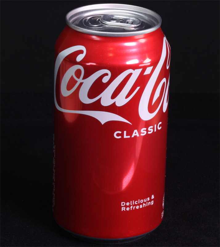 More Correct for Older Displays. |
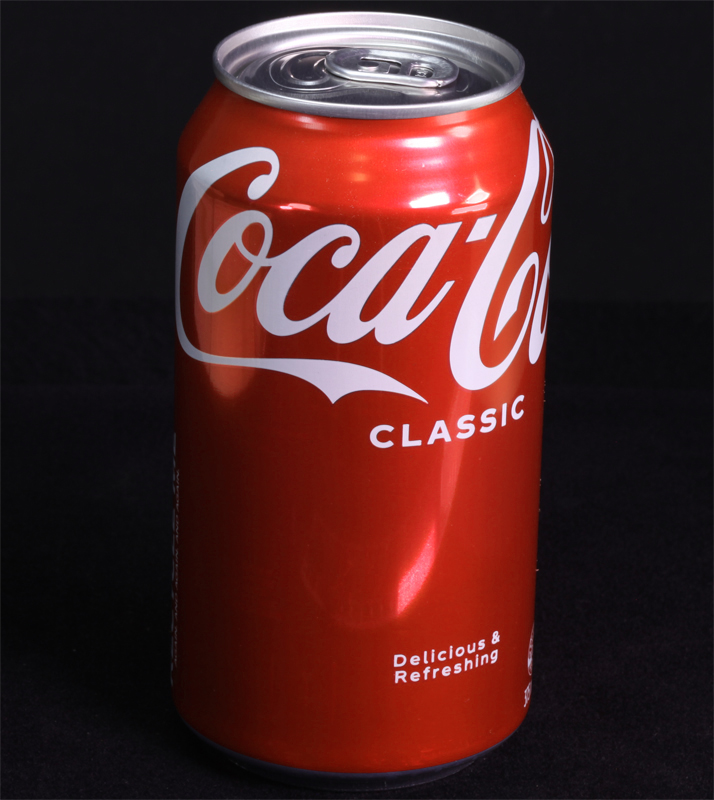 More Correct for Newer Displays. |
On newer devices the coke can on the left will appear a little bit of a darker red than they are in reality and on older devices the coke can on the right will appear a little bit of a lighter red than you'd expect in person. For a coke can the colour differences is only fairly slight and not important but you can see how much difference this can make for the following specimen :
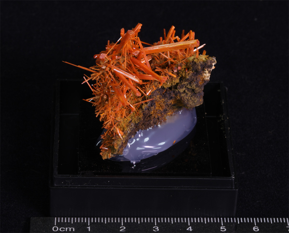 More Correct for Older Displays. |
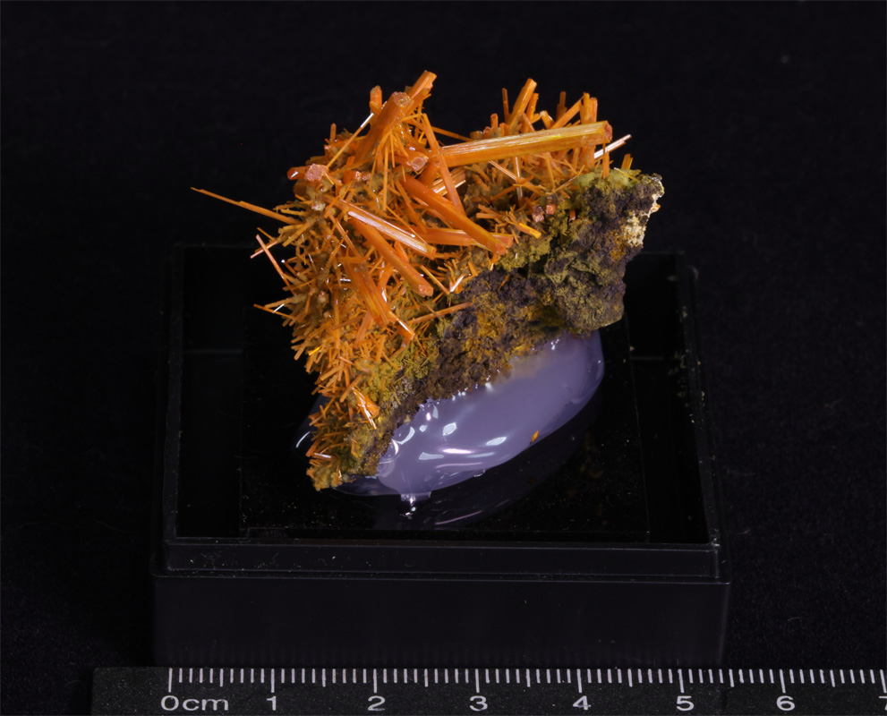 More Correct for Newer Displays. |
From now on I will add a page showing images in the correct colour for older devices and also another page with images suitable for newer devices.
You can use the images above or this basic Colour Test Page to check which of the pages will be the most appropriate for you to view.
Other Notes :
The dimensions shown for specimens are listed apply for the item as it is positioned in the first image.
The detailed specimen images now show the items being turned in 90 degree increments as they are rotated through 360 degrees clockwise like :
